Design Tips for Premium NFC Business Cards
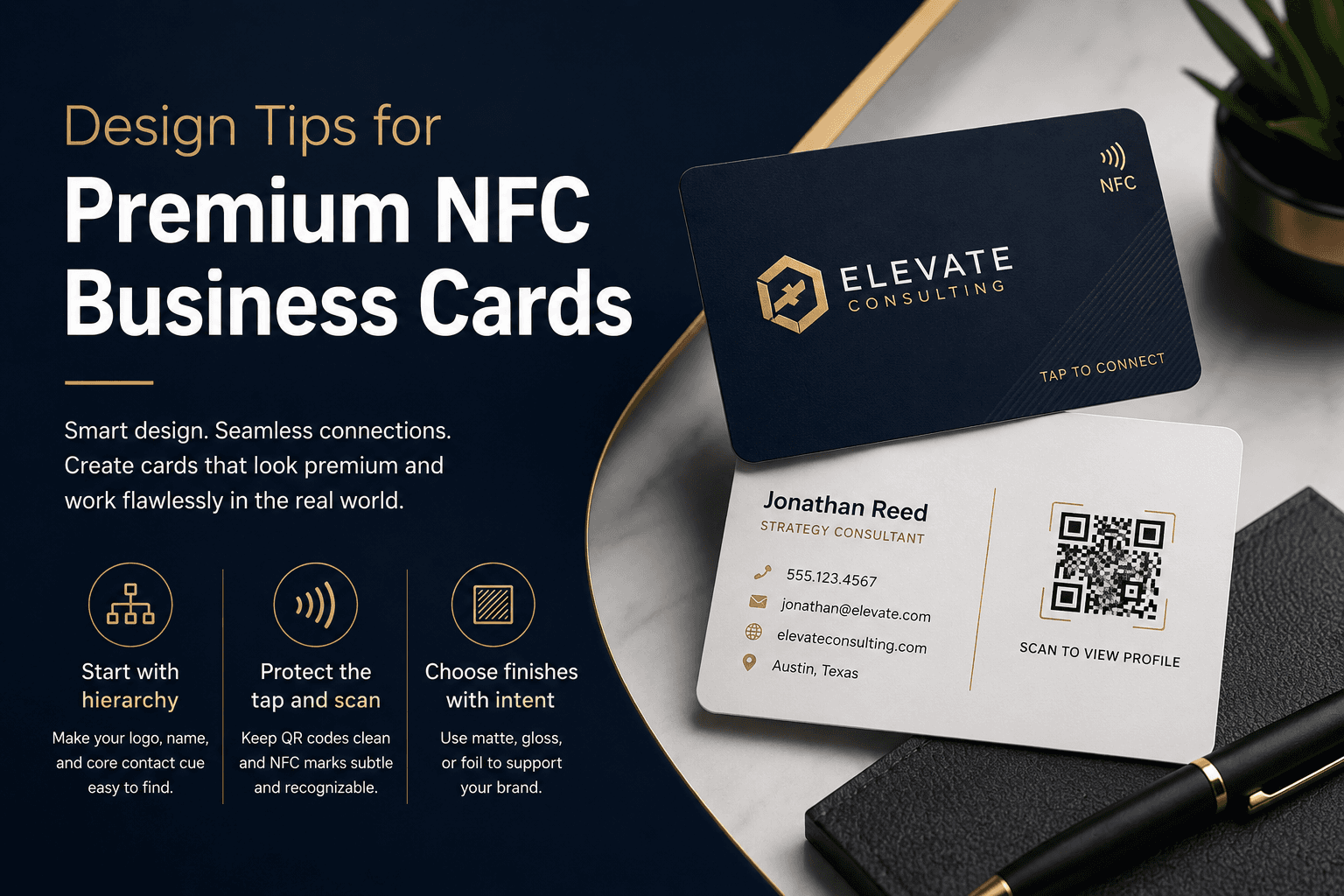
Premium NFC cards need more than a sharp logo. These design choices help your card look refined and work well in the real world.
Start with hierarchy
A strong card has a clear reading order. Your logo, name, and core contact cue should be easy to find at a glance.
Avoid packing every possible detail onto the printed card. Let the digital profile carry the extra information so the printed design can stay calm and confident.
Protect the tap and scan experience
If your design includes a QR code, keep the area around it clean and high contrast. If the card uses an NFC tap mark, make it subtle but recognizable.
Materials and finishes also matter. Heavy gloss, metallic effects, and dense textures can look excellent, but they should be balanced with readable text and reliable scan zones.
Choose finishes with intent
Matte finishes feel refined and reduce glare. Gloss can make color feel vivid. Foil or metal effects add presence when used sparingly.
The right finish should support the brand, not distract from it. If the card needs to feel executive, keep contrast high and decoration controlled.
- Use matte for understated, readable cards
- Use gloss when color impact matters
- Use foil accents for logos, names, or small details